
A law firm website has one job before anything else: help the right person feel safe enough to contact you. People rarely browse legal websites for fun. They arrive with a problem, a deadline, fear, confusion, or pressure. Good law firm website design respects that state of mind. It makes answers easy to find, trust easy to feel, and action easy to take.
Start With the Question Every Visitor Is Really Asking
Most legal visitors are not thinking, “What a beautiful website.” They are thinking, “Can this firm help me, and can I trust them?” Your design should answer that quickly.
That means your homepage should not open with vague slogans or oversized legal language. It should make your practice areas, location, and next step obvious within seconds. A family law visitor, injury client, or business owner should immediately know they are in the right place.
Your first screen should usually include:
- The main legal service you provide
- The city, state, or region you serve
- A visible phone number
- A clear consultation button
- One short trust signal, such as years of experience or client reviews
This is where branding matters too. Even a simple wordmark can make the site look more polished, especially for solo firms or new practices. If you are still shaping your visual identity, a text logo maker can help you test clean, professional logo ideas before investing in a full brand package.
Make Mobile Visitors Your First Priority
Legal searches often happen in urgent moments. Someone may be standing outside court, sitting in their car, or quietly searching from their phone after a stressful event. Your mobile version cannot feel like an afterthought.
According to Google’s mobile speed research, 53% of mobile visits are likely to be abandoned when a page takes longer than 3 seconds to load. For law firms, that can mean losing a client before they even read your practice page.
Focus on simple mobile rules:
- Keep menus short and easy to tap
- Put click-to-call in the header
- Use large buttons with clear labels
- Avoid heavy images that slow the page
Mobile design is not only about looking modern. It is about removing tiny frustrations at exactly the moment someone is deciding whether to call.
Turn Practice Area Pages Into Client-Focused Guides
A strong law firm website needs more than a homepage and contact page. Practice area pages are where many visitors decide whether your firm understands their specific problem.
A personal injury page should not only say, “We handle injury claims.” It should explain what happens after an accident, what evidence matters, how timelines work, and when calling a lawyer makes sense.
The same applies to divorce, estate planning, immigration, criminal defense, employment law, or business disputes.
Good practice pages usually include:
- A plain-language explanation of the legal issue
- Common situations clients face
- What the firm can help with
- Local references where relevant
- A direct call to action
Important note: legal content should educate without promising outcomes. Clear information builds trust, but guarantees can create ethical and credibility problems.
Use Trust Signals Without Making the Site Feel Loud
Trust signals matter, but they need to feel earned, not pasted everywhere. A homepage covered in badges, awards, pop-ups, and review widgets can feel more like a sales page than a professional legal website.
Better design uses trust signals in the right places. Add testimonials near service explanations. Place attorney credentials close to consultation prompts. Show bar admissions, memberships, publications, or case experience where they support the visitor’s decision.
Here is a simple way to think about it:
| Trust element | Best place to use it | Why it helps |
| Attorney bio | About page and service pages | Shows real expertise |
| Client testimonials | Homepage and intake pages | Builds confidence |
| Awards or memberships | Homepage footer or bio page | Adds credibility |
| Case examples | Relevant practice pages | Shows experience carefully |
The goal is not to overwhelm people with proof. It is to give them enough confidence to take the next step.
Design Contact Paths for People Who Are Ready Now
Many law firm websites lose inquiries because the contact process feels too slow or too demanding. Someone may be ready to call, but the phone number is hidden. They may want to send a message, but the form asks for too much.
Keep your intake options visible and practical. A short form usually works better than a long one. Ask for name, phone, email, legal issue, and preferred contact method. Save deeper intake questions for after the first response.
Clio’s 2022 Legal Trends Report, referenced in its client communication guidance, found that 68% of clients expected lawyers to communicate outside traditional business hours. That does not mean lawyers must work nonstop, but it does show why fast, clear response systems matter.
Useful contact features include:
- Click-to-call buttons
- Simple consultation forms
- After-hours message confirmation
- Clear response-time expectations
A visitor should never wonder, “Did my message even go through?”
Make the Website Feel Local and Specific
Local clarity is one of the easiest ways to improve client inquiries. People usually want a lawyer who understands their jurisdiction, court system, local procedures, or regional business environment.
Do not hide your location in the footer only. Mention your city or service area naturally on key pages. Create location-specific pages only when they are genuinely useful, not as thin SEO pages with swapped city names.
A strong local law firm website design should include your office address, parking notes if relevant, nearby courts, consultation availability, and the communities you serve. This helps both users and search engines understand where your firm fits.
Keep the writing natural. “We help employees in Austin with workplace retaliation claims” is better than repeating “Austin employment lawyer” in every paragraph.
Keep Accessibility and Readability Built Into the Design

Legal websites should be easy to read for everyone. That sounds obvious, but many sites use pale gray text, tiny fonts, crowded paragraphs, and buttons that disappear into the background.
The W3C Web Content Accessibility Guidelines 2.2 include contrast recommendations for readable text, including stronger contrast for normal text and large-scale text. Good accessibility is not just a technical checkbox. It makes the site easier for anxious, older, mobile, and visually impaired visitors to use.
Practical readability rules include:
- Use clear font sizes
- Keep paragraphs short
- Choose strong contrast
- Label buttons clearly
- Avoid legal jargon where plain English works
Readable pages also feel more trustworthy. If people understand you, they are more likely to contact you.
Match the Visual Style to the Type of Law You Practice
A criminal defense website should not feel exactly like an estate planning website. A corporate law firm should not sound or look identical to a family law practice. Different clients bring different emotions, risks, and expectations.
For sensitive personal matters, softer colors, calm spacing, and reassuring copy can work well. For litigation or business law, a sharper, more structured layout may feel more appropriate. The key is alignment. Your design should support the emotional state of the client you want to attract.
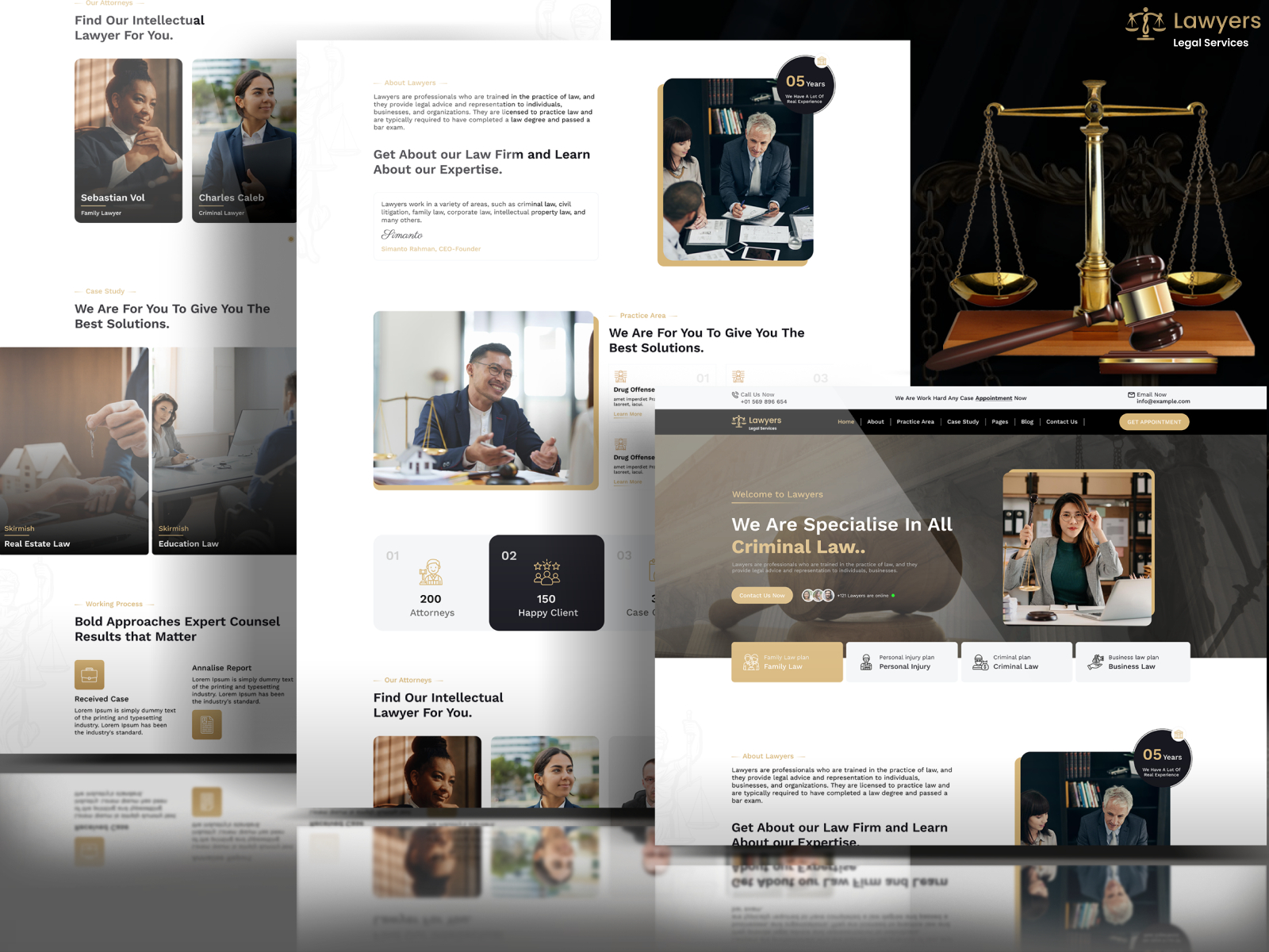
Still, avoid going too dramatic. Dark court imagery, aggressive taglines, and stock photos of gavels rarely make a firm feel more credible. Clean layouts, real attorney photos, clear pages, and confident language usually do more.
FAQs
1. Should a law firm website include pricing?
It can, but only when it makes sense. Flat-fee services, consultations, or document packages are easier to show than complex litigation fees. Even if you do not list exact prices, explain how billing works so visitors feel less uncertain.
2. How often should a law firm update its website?
Review core pages at least twice a year. Update attorney bios, practice descriptions, testimonials, office information, and outdated legal references. A neglected website can quietly weaken trust.
3. Should law firms use AI chat on their website?
AI chat can help with basic routing, but it should not give legal advice or collect sensitive details without safeguards. Keep it limited, transparent, and connected to a real intake process.
Final Thoughts
Better law firm website design is not about adding more effects, more pages, or more dramatic visuals. It is about making the path from concern to contact feel simple and trustworthy.
When your site explains clearly, loads quickly, works well on mobile, and gives people an easy way to reach you, it becomes more than a digital brochure.
It becomes a real client inquiry tool.


